07/05 – 01/06/15
17th Century Dutch Still Life and Flower Painters
Look at the work of some of the 17th Century Dutch still life and flower painters. Make notes on paintings that you particularly admire and find out more about the techniques that were employed at the time.
Gerrit Dou – Sleeping Dog
Floris van Dijck – Still Life
Ambrosius Bosschaert the Elder – Flower Still Life
Willem Kalf – Still Life with Silver Jug/Ewer
Pieter Claesz – Still Life with a Skull
Willem Claeszoon Heda – Still Life Vanitas

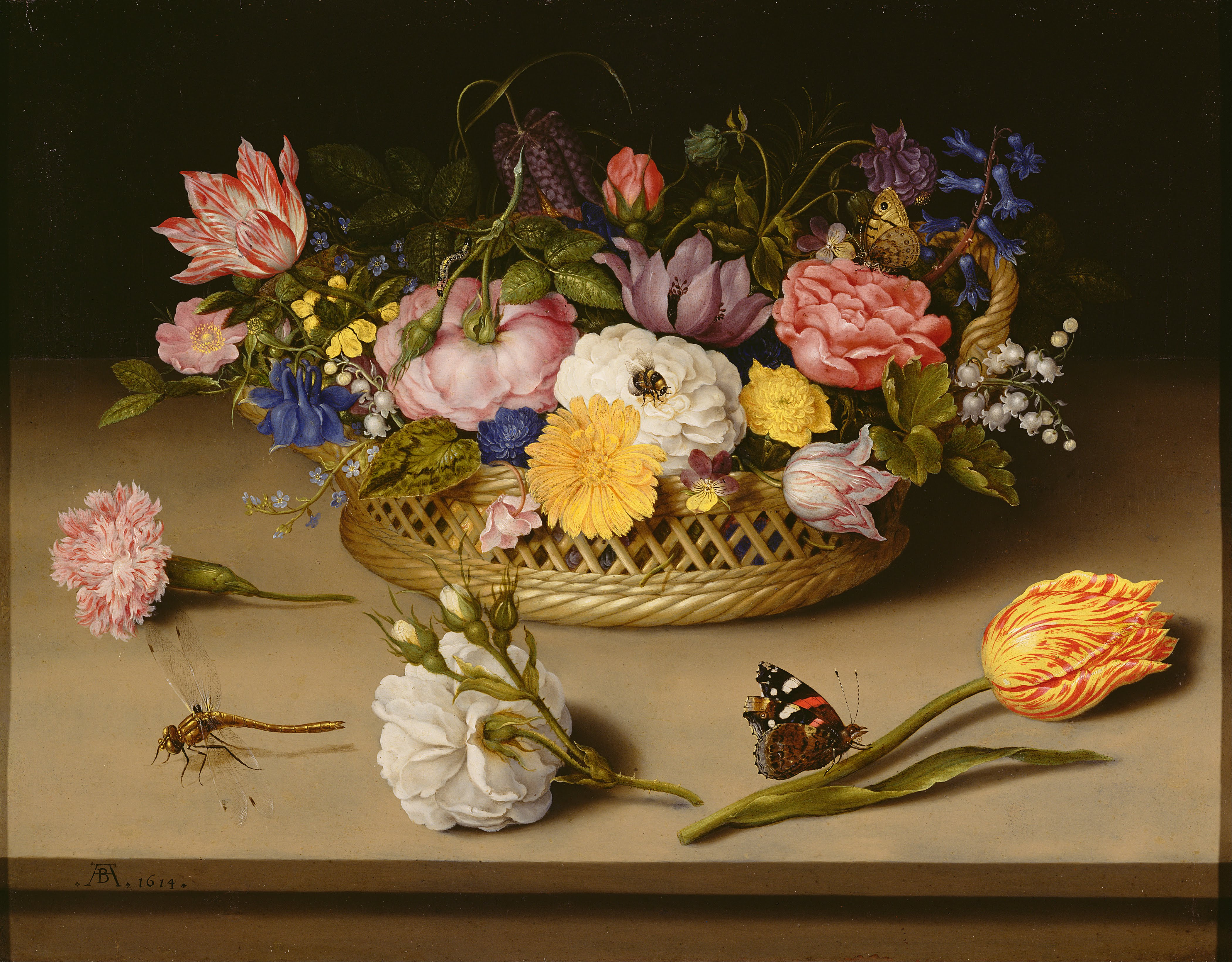
Flower Still Life by Ambrosius Bosschaert the Elder
We were asked to look at flower paintings as well as still life as a whole. I have to be honest I found the flower arrangements left me cold. Whereas I can appreciate that they were beautifully and skilfully painted, they appeared too perfect and posed. I love plants and flowers, however, these made me feel they were artificial somehow. Flowers that would not have bloomed in the same season were put together, maybe due to the fact that horticulture had become highly fashionable and this may have increased the popularity of this genre.
Of course, the Netherlands became extremely prosperous in this age due to the successful trading by Dutch merchants. Home interiors became more opulent and ostentatious in decoration. Art and commissions thereof, were more within the reach of the new middle merchant class. Food was particularly used as a subject for still life paintings, tables piled high with seafood, cheeses, meats and exotic fruits newly discovered, sometimes to extent of gluttony.

Still Life by Floris van Dijck.
Regarding the subject of food, I’ve picked out this still life by Floris van Dijck depicting the more simple fare of bread, cheeses, fruit and nuts, and a plain glass of water. This does not induce the nausea and feeling of indigestion that others with whole lobsters, rich meats and overflowing wine etc do! This is also beautifully painted and has colour yet is not overwhelming. It does however, still have a level of symbolism, the apple peel starting to brown and the plate of bread teetering on the edge of the table give sense of an upset waiting to happen, the favourite caveat of our not being immortal and that all good things come to an end.

Sleeping Dog by Gerrit Dou
I loved this painting of a sleeping dog by Gerrit Dou. It looks so peaceful and somehow reassuring compared to the pretentious wealth often rendered in still life. The dog sleeping next to the clay pot with an imperfect broken lid, a bundle of sticks ready for the evening fire and the master’s clogs awaiting his return. However, I’m a little disquieted when I realise that animal still life is probably just that – is the dog really sleeping? Hope so!

Still Life with Silver Ewer by Willem Kalf
As this is supposed to be about painting I especially admire, I had to include this one by Willem Kalf. The brush work and colours are beautiful, sensitive and realistic. The silver jug has the different textures associated with burnished and hammered silver in its decoration, with the reflected light of the lemon adding to its luminosity. The lemons themselves could almost be plucked out of the porcelain bowl, particularly the semi peeled fruit. The oriental bowl has just enough highlight from a secondary or reflected light source to ensure its position in the shadow. It is a painting that I could look at for a long, long time.
As far as techniques are concerned, I couldn’t find any specifics in my research but from observation, many used chiaroscuro to help sculpt and mould the 3D image as in the example above (Willem Kalf). This gave the illusion of placement and form of objects against a dark background, throwing focus on specific items. Others gave a fairly equal light source so that everything may be seen clearly, this technique was particularly common with the vanitas paintings where a message was being conveyed to the viewer. Sometimes these paintings were so full of symbolism and objects upon objects that it is almost a game to pick them out.
Research at least one painting that has iconographic significance. Which of the objects depicted carry particular meaning and what was that meaning?

In Vanitas Still Life by Pieter Claesz
Vanitas paintings were very popular and a recurring subject for still life. A common component was the depiction of a human skull and bones, not unsurprisingly, this signified the mortality of man, in fact most symbolic objects made reference to the passing of time and the inevitability of death. In the Vanitas Still Life by Pieter Claesz (left), the oil lamp has just been extinguished with trickle of smoke wafting away, the upturned glass emptied of its contents, speak of the end of life. Watches (as in this example), clocks and time generally tick away and will eventually stop. Books, literature, music etc are earthly pursuits with no value after death – often in these paintings, a musical instrument with a broken string will give the same message. There are symbols of life and rebirth such as shells, ivy or laurel (anyone trying to eradicate these from their garden would get this one!!!). Flowers are also full of meaning, some have more than one depending on era and cultures. The Lily for example denotes purity and innocence, the rose has multiple meanings depending on its colour. In the above painting there is a key on a ribbon, researching the symbolism of keys, I discovered that spiritual leaders or monarchy are often shown holding keys as a symbol of power – the power of opening and closing – the power of opening the door between one world and the next, the mortal and the afterlife maybe.
Then explore the development of still life through the eighteenth, nineteenth and twentieth centuries. For example look at how traditional still life subjects were dealt with in some early Cubist paintings by Braque and Picasso. Investigate how some contemporary artists are interpreting this genre.
18th Century
Jean-Baptiste-Simeon Chardin (1669-1777)
When trying to recall some of Chardin’s work, nothing came to mind initially, however, after looking him up I realised I had actually seen some of his work. The Ray, I had seen in the Louvre a while ago and I’m fairly certain I had also seen his self-portrait. On researching some of his still life paintings, I found a couple that caught my eye in particular, Still Life with Plums and The Copper Cistern.

Still Life with Plums by Jean-Baptiste-Simeon Chardin
The Still Life with Plums resonated because the bottle used within the composition was similar to that I had used in my Assignment One still life. In fact, digging out my tutor’s report I found he had picked up (however fleeting) a similarity between Chardin’s style and this effort of mine. However, looking at both the Chardin reproduced on-screen and my original work, I can see so many aspects I must work on. Whereas although Chardin’s painting is dark in tone, there is still a lightness of touch, his darks are not “muddy” as mine are. The glass of the bottle has a transparency that mine should have had but I achieved only a dull opacity. This has illustrated clearly that a darkness of tone does not have to mean dull. As Chardin’s life crossed over the 17th and 18th Centuries, there is an inevitable foundation in the Golden Age styles, although it is said his work was a big influence on the cubist painter Georges Braque, which is why I initially chose to research him.
19th Century
Gustave Courbet (1819-1877)
Courbet is another artist mentioned by my tutor in the Assignment One feedback report, particularly referring to the apple I had attempted. From this I thought it prudent to look at Courbet’s fruit still life of which he painted many.

Still Life with Apples by Gustave Courbet

Still Life by Gustave Courbet
These two examples of Courbet’s still life with fruit still have their origins in the Dutch Golden Age of the genre for their composition in my humble opinion. However, the main difference I see is that Courbet paints what he sees, not to show opulence and wealth but reality. He painted the fruit with all its imperfections, seeing the interest and individuality, he painted not just an apple but that actual apple. His brush work is looser, whereas the Dutch still life have an almost photographic feel (from my modern-day perspective). Courbet has a more “painterly” expressive style that seems to be a stepping stone to the Impressionists (and after reading some more – the Cubists – this I will have to research for myself!).
20th Century
Pierre Bonnard (1867-1947)

Table in Front of the Window by Pierre Bonnard

Table in Front of the Window by Pierre Bonnard (Detail)
The still life paintings by Pierre Bonnard are more colourful and vibrant than previous examples shown. They also provide a sense of place for the subject, which I particularly like. Bonnard had a way of playing with perspective and giving a flatter, more pattern-like image. His mark making and placement of composition were more creative and imaginative although the subject is still representative. There is more “life” in his still life!

Still Life with Table Cloth by Pierre Bonnard
Georges Braque (1882-1963)
I had always heard the name of Georges Braque linked with Picasso and had seen a documentary about his life some time ago, however, I hadn’t really looked at his work in any detail before. Concentrating on his still life paintings, I am surprised at how his style evolved. I found some very stylised cubist paintings that are earlier than his more representational work, examples below. Did he feel that cubism had run its course and return to a more “traditional” (for want of a better work) style? I note that one of his many influences was Cezanne, which seems to become more apparent in his later work.

Musical Instruments 1908 by Georges Braque

Bottle and Fishes 1910 by Georges Braque
Musical Instruments and Bottle and Fishes are separated by 2 years and the transition of style is subtle and readable. The palette is similar and the instruments are becoming more geometric in shape than realistic. The Bottle and Fishes take the angular and flat planes further, yet the subject is still discernible with study and has depth and three-dimensional illusion.

Still Life with Blue Plums and a Glass of Water 1925 by Georges Braque

Still Life: The Table 1928 by Georges Braque
Moving on around 20 years give or take, and the style has further evolved. Curves have reappeared and composition is more considered. Colour is more evident than tone, particularly in The Table, shapes are still pattern and favourite motifs are revisited. Darks are treated as another object almost, shadow is solid and part of the pattern, something also exploited by Patrick Caufield as researched in Drawing One.
Pablo Picasso (1881-1973)

Still Life – The Dessert 1901 by Pablo Picasso

Still Life 1919 by Pablo Picasso
Picasso also had an interesting evolution regarding still life, the above span 18 years between them and show little inclination towards to the cubist style.

Still Life with Bull’s Skull 1939 by Pablo Picasso

Still Life with Cheese 1944 by Pablo Picasso

Still Life 1947 by Pablo Picasso
These three examples show clearly the path followed of simplification and importance of line in the shapes of the image. Still Life with Bull’s Skull has the beginnings of using geometric pattern and line although the angles and flat planes seem confined to the surface and background rather than the objects themselves. Still Life with Cheese follows through the line of the surface into the objects making pattern with geometric shapes and the final Still Life has completely simplified the image. I chose these three examples as I’m fairly sure the same jug or coffee pot was used in each arrangement and further illustrates the way Picasso has chosen to represent it.
Examples of Contemporary Artists Interpretation of the Genre
Coming to this section, I was keen to explore a photographer I had seen recreating 17th Century Dutch still life paintings with photography. I had seen a BBC documentary exploring the genre of Still Life painting and had intended to refer to it for this research, however, it is no longer available on iPlayer and I can not remember the name of the photographer highlighted in the program. Searching the web I came across this photographer making this very subject matter. Here is a link to his website:
http://levinrodriguez.blogspot.co.uk/2012/06/reproducing-dutch-golden-age-still-life.html
It is intriguing as to how complex it is to set up the arrangement and particularly, the lighting to recreate these paintings. It does, in fact, make me admire the skill in the masters of the genre even more.
With the digital age, Still Life can take on many different media, not only the traditional painting, printing and collage but photography (as touched on above). Ori Gersht is an Israeli artist who has explored this with his Blow Up series of photographs. He sets up his subjects and using cameras that are so fast ie 1/6,000 of a second, he can capture the exact instant the object (e.g. a vase of flowers) shatters – producing a still life of an explosive split second as if it hangs in suspension for his image and is truly still.
Another contemporary artist that I have seen a documentary about is Marc Quinn. He has made a series of cast head sculptures of himself, arguably, it could be said that this is not a still life as such, however, the twist is that the moulds are filled with his own blood that his collects over time. These casts are kept frozen in a temperature controlled cabinet. Quinn creates a sculpture every 5 years to record the passage of time on his own features, and, if I remember correctly, contains the same amount of blood in volume as circulates through the body. Therefore, these works are truly still life. One of these sculptures is on display in the National Portrait Gallery and I can’t resist visiting it each time I’m there.


