27/06/17
Assignment 4 – Collatype Collage Block Prints
Present two prints of your textured collage test block with a descriptive statement
Descriptive Statement

Test block sectioned with items glued down ready for sealing
The materials are listed from left to right, top row first.
Number one, the double stripped trim printed well and depending on the pressure used when inking, gave a variety of marks ranging from parallel fine lines, to more solid, thicker ones. It was easily malleable into shapes and could be twisted for interesting patterns.
Number two, the textured knitting yarn printed as a broken line mostly which occasionally linked up, it was very flexible even more so than number one.
Number three, the wide gauge embroidery mesh was stiff and unyielding, its main properties were that it gave a distinctive grid and could therefore mimic harder substances such as iron mesh or bars. It could easily be cut into specific shapes and would stay stable when being glued.
Number four, the gauze bandage was extremely easy to manipulate. It could be stretched, twisted, laid flat or layered and easily frayed at its edges. It could give the impression of flowing movement and shapes and was particularly useful for describing tone. I was a little disappointed with the straight relief inking with the black ink, however, when inking with a dabber and wiping, the results could be very versatile.
Number five, the ribbon. This was great to use as it was flat and the longer strip lent itself to being twisted and was still sufficiently stuck down with the glue. It worked well with the relief printing but I particularly liked the effect when the ink was gently wiped away to some extent. This then gave lovely highlights and really replicated a silky texture with the edges being more defined.
Number six, the bubble wrap was quite interesting particularly where the polythene creased. I was less drawn to the more solid bubble shapes than I was the twisted and stretched appearance. It was also flexible enough to twist although it needed a fair amount of glue to stabilise it. From this I think I would also like to try using some cling film, scrunched, twisted or creased
Number seven, the netting used to package supermarket fruit was a great texture. It was similar, although stronger to the gauze bandage and wouldn’t fray. It would particularly print well with the black ink and gave a random texture that could be very useful.
Number eight, I was unsure as to what results the handmade paper would achieve. It is a lovely texture that when torn, behaves almost like fabric in the way that it frays. I have used it before in mixed media painting where water-soluble paint clings to the frayed edges in an interesting way, hence my trying it here. In effect, it gave a nice texture but in a way that the source was not identifiable.
Number nine, the buttons were a fun addition, although, they really did just look like printed buttons so maybe not as versatile as the other materials.
Number ten, the dress making pins printed much better than I anticipated although again as the buttons, I don’t think I would use them very often.
Number eleven, dried spaghetti also printed well. This could be really useful where straight lines are called for, they can be broken into different lengths, used at angles, spaced apart or brought close together for texture.
Number twelve, porridge oats. I had obviously raided the kitchen cupboards for these few materials. These were a little disappointing in pure relief yet with more ink added and wiped, they could be useful for textures and tone, and also for using in conjunction with other similar materials of differing sizes (see number fifteen).
Number thirteen, long grain rice is a hard substance when raw and is surprisingly random when printed, great for texture, tone and highlights if wiped. The grains also printed very cleanly when printed in relief.
Number fourteen, Florists’ Winter Fauna is the name on the packet. a useful dried bundle of organic matter that florists use to enhance display designs. Theoretically, it could be used as a collage material in a clump or pulled apart to separate the strands as here. However, although it printed well the main challenge is getting it to adhere to the block as it is so curly and not overly flexible.
Number fifteen, gardeners’ potting grit. Fairly small-grained grit that gives a lovely random texture when printed. It also sticks down very well.
Number sixteen, dried, broken egg shells. These have been saved over time and are really useful for collage. If the pieces are too big when being stuck down, they can break down further and give an interesting, almost tortoise-shell effect.

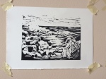
Second relief print of test block with black oil based ink

Mix of relief and intaglio printing in multi colours from test block
I have selected print two of four for the black and white prints and print one of four for the coloured prints. A slightly different choice than previously made at the end of the exercise due to the clean appearance of the black and white relief print.
Present three versions of your collatype collage block print exploring a representational theme and a variety of collage techniques accompanied by a critical statement about your choice of subject and the way you have translated it into print.
After deciding to create a triptych type print series for my project, I have selected the three images below to represent my subject.

Final three selections from each image for assignment 4
Critical Statement
I initially quote from my write-up of Project 12 itself:
“Over the time my previous assignment was in transit and with my tutor for feedback, I began thinking about what subject I would like to tackle for this project. Many things were in the news at the time not least the effects of climate change and the continual, nonsensical 140 character ramblings of the new president of America. This one particular morning, the two collided once again, and the short-sighted lust for dollars over having a sustainable planet for the future of humankind hit the headlines. I had my subject.”
The more I explored ideas around my subject, the more I realised that one image would not suffice to put across my intention of drawing focus to this potential backslide to planetary destruction. Attention had to be on the misuse of power, the concern that this attitude may grow and continue in the wake of such an influential climate denying government and the dramatic results of such. As with many messages conveyed through the visual arts, I have tried to simplify and symbolise the message.
The portrait of POTUS stands as a figurehead for all those that ignore, deny and seemingly despise the science and evidence before us. Going back to my initial sketchbook thumbnails, the objective was to create a portrait of Donald Trump to illustrate the smugness with which I perceive he has taken power of one of the largest nations on the planet. That planet is under threat by human hand and he and his band of climate deniers are ploughing ahead with many policies to further the business dollar at our future’s expense. I need the portrait to describe this smugness and for his image to be recognisable. The use of some of the collage materials, in my mind, lend themselves to a pixellated image not unlike a comic book illustration. The use of orange flesh also help to give the impression of the real life caricature I see. It also serves to remind us not to dismiss the apparent incredulity and initial ridicule that we may think protects us from such people’s attitudes and opinions, they are not alone.
The combination of the portrait and landscape in a more linear image serves to illustrate that the shapes that we make and the decisions that we take are intertwined with all that is around us. Eventually, we as humans will become part of the landscape. We as individuals are merely blinks in the eye of time. We are transient but our attitudes and actions have repercussions and will carry on – we need to ensure that we make the right ones for humanity’s future. This I have tried to describe by bringing the two outlines together with stripes of colour, loosely relating to earth, sea and sky. No one human being is all omnipotent – hence the amalgamation to reduce their self-perceived power, the natural world will overcome its challenges, if given the opportunity.
The final image is to represent the earth’s warming, the melting ice caps, rising sea levels and the decimation that may ensue if we allow it, such as encroaching deserts and then little by little, in the loss of our familiar flora and fauna and so on…
Reflection
Overall I have enjoyed this particular section of the course. I feel it has allowed me the freedom to experiment with many types of materials and techniques without being overly process driven. This, now I read it back, seems contradictory as I have begun to develop my own process. I have acknowledged the need for organisation and structure to produce better quality and clean print productions. However, what I think has happened is that I am now doing this more naturally and everything feels less forced.
Measures against criteria:
Demonstration of Technical and Visual Skills – I have become less concerned about the lack of specific materials in my location and have begun to see this as a way to think differently and be more creative in how I achieve outcomes. I am more patient, and in particular in Project 12, by expanding the brief and creating different images, I have been able to organise the stages of work and maintain productivity ie performing a process on one image whilst another dries etc. The sketchbook work has also allowed me to improve my design and composition, by visualising images and simplifying them for printing.
Quality of Outcome – allowing myself time to experiment with technique and material options, to work through ideas and visualisation and very importantly, to change my mind as a result, I feel I am closer to realising my ideas when I commit to the final work. In these projects, I have had less mishaps with the actual printing and the results have been cleaner and sharper than in those previous.
Demonstration of Creativity – previously, I always felt that my skills were very representational ie drawing from observation etc, and my real shortcoming was when asked to use my imagination and create from scratch. I now feel that once I have my subject, I am brimming with ideas to illustrate its concept. As for the subject itself, combined with finding my personal voice, I’ve discovered that as long as I have a passion for that subject, I can drill down into it and find a “hook” to work with. From being able to draw fairly well, I now feel I can actually be creative from within myself. The more I do this the more confident I become.
Context – I realised some while ago during this learning process, that I am naturally a reflective person, I am also very self-critical – particularly negatively. This has good and bad connotations, although I am learning to turn that criticism into a more objective trait, particularly with making choices about ideas to take forward and selecting my work. I still enjoy the research aspect and have learnt to filter out what I need and want from it rather than become swamped in data. I try to keep my learning log succinct and easy to navigate, not least for myself to refer back to past projects.
Going forward, I feel more in control of my own outcomes, not least in having learnt to let go of the control and let things evolve. I like the elements of contradiction and experimentation that have emerged from these projects.