Project 12: Collatype Collage Prints
09/05-20/06/17
For this project you will be working towards a series of representational images.
Over the time my previous assignment was in transit and with my tutor for feedback, I began thinking about what subject I would like to tackle for this project. Many things were in the news at the time not least the effects of climate change and the continual, nonsensical 140 character ramblings of the new president of America. This one particular morning, the two collided once again, and the short-sighted lust for dollars over having a sustainable planet for the future of humankind hit the headlines. I had my subject.
I had an initial image in my head of a corporate “suit” lugging a sack of coal (much like the coal men of my rural youth – who used to deliver to our house every month), through a devastated landscape. The value of the coal far outweighing the value of his surroundings in his perception.
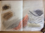
This is how I began to thrash out my ideas in my sketchbook. I explored variations on this theme, morphing the dollar sign, using little, round, suited businessmen, adding text etc and kept coming back to this one man who has the audacity to abuse his dubiously acquired power. It became clear that one image would not sufficiently describe where I was heading. I had a rough vision of the decimated landscape, however, I had to bring “him” in to it too! I started researching and put out a Google search for “smug images of Donald Trump” and was presented with several pages full! As in the public domain, and as my final choice as source material did not have a photographer noted, I am unable to give him or her acknowledgement. I made a few sketches and realised that I needed to simplify the image considerably to have a chance of making it work as a collatype block. See sketchbook pages below:
Once I had the thumbnails finalised for my three images and had squared them up, I then had to enlarge the scale of each to 24x32cm ie four times the size of the thumbnails. Enlarging the images to this size on paper made it easier to see them in a simplified way and to consider the collage materials that may work from which to print.
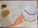
The images were then traced and transferred to the same sized card with which I could make each print block. Once these were ready, I then returned to my sketchbook to explore the collage materials that would create the shapes, layers, textures and tones required. From working through each image in my sketchbook, I decided to have texture and tone evident in both the first (portrait) and third (landscape) print block, and due to the two layers, chose to use varying line thicknesses to create a cleaner effect in block 2. Using the test block created in Project 11 to guide my choices, I stuck my selections in my sketchbook. I was initially going to create a page per block, but I seemed to gain sufficient knowledge for each and could use similar materials for all of them, although I kept to different thread and strings for number 2. Once the collage of each block was complete, I fixed the reversed tracings on the wall, along with a pencil rubbing of the portrait as this was the trickiest to visualise. See below:
Once the print blocks were complete, I set about researching inking techniques to achieve the images I envisaged. I took my time here as I suspected this would be almost the most crucial element for success. The books I looked through are as below, along with my thoughts prior to printing my images:
Printmaking Handbook – Collagraphs and Mixed Media Printing by Brenda Harthill and Richard Clarke
ISBN 978-0-7136-6396-9
I was interested in the blind printing or embossing techniques as one layer of print. This would add a 3D effect that may help delineate shapes – particularly for the portrait and combined images.
It was also noted how weak colour can enhance a sculptural effect. Some of these ideas can be tried out using newsprint first, although, I would imagine that thicker paper may be more successful for blind printing. In particular, for the third image in the series – the environment post climate change – would benefit from the rubbing of weak ink into the blocks – using blues/greens/grey-blacks for atmosphere and texture combinations.
Learning Linocut by Susan Yeates ISBN 978-0-7552-1330-6
Referencing particularly the inking techniques and tips on page 73 onwards.
Rainbow rolling – alluded to in the course materials also. this may be an additional method to add interest to the combined image (block 2). Considering using “blind printing” then overlaying with rainbow rolling. Other tips were dabbing much smaller areas with a cotton bud – also with homemade dabbers or scrim/muslin pads.
Results of experiments:
I experimented quickly with newsprint, taking a blind print of each block. They rendered unremarkable results, probably due to the thin paper which creased very easily. Using a swatch of the print paper I intended to use for two of the prints, one dry and one damp, I obtained better results. The best being with the dampened paper. Although I am not convinced that it will add anything to these particular images. Using the cartridge paper – the dry paper was nondescript, however, the dampened cartridge was much more successful, shower finer embossed details.
I had intended to use smooth, ivory Somerset printing paper for the middle image which will effectively be linear rather than tonal as it overlays two images. My thinking being that the paper would add another element to the print. It also appears less processed and bleached – giving the impression of being environmentally friendly – as I have limited choice and I have never made my own paper before – it would have been nice to use recycled paper I made myself, maybe another time. For the other two more textured and tonal prints, I intend to use the cartridge paper which performed well in the experimental blind prints.
Inking of Blocks
I prepared my ink plate taking into consideration what I had learnt and researched, taking each block in order. I prepared trial swatches of colour mixes for each and kept them available for reference for each inking of the blocks. See photos below:
All printing paper had been soaked and blotted to achieve a damp surface for printing.
The specification of the colours to use were merely a starting point, and it became obvious that using a roller to apply the ink for both the portrait and the landscape were not an option. Instead, homemade ink dabbers, pieces of rag/muslin and cotton buds were used for adding and wiping away ink to help achieve depth, translucency and tone as required. Coincidentally, four prints were taken from each block, each of which were scrutinised and analysed to adjust the inking for the subsequent prints. It was noted, especially after the experiments with blind printing, just how much pressure was needed in specific areas to achieve a successful result. The outcome being, a print that was also embossed without a separate blind print. Only once did I re-register a print to add additional ink, that being the portrait (number 4 print I believe), this served to make me realise that doing this was a risk I didn’t want to take.
It was extremely hard work ensuring that the correct pressure was applied to each pull of the print and it did make me wonder if using a press with the softness of a “blanket” combined with a mechanical pressure would have been physically “easier” and more controllable. However, I did feel very connected to each result with the effort I had put into it.
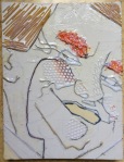
Below are photographs of each print per block with associated self critique and notes taken at the time.
Portrait Image:

Print 1 – Improvements : work dark to light, hair needs more dark for depth, shadows more brown/black, top lip should be darker than bottom, more orange on the ear, more dark above collar and under eyebrows

Print 2 – Improvements: More yellow on hair and eyebrows, more orange on edge of face, ensure ink is pressed into lines, more dark on gauze around eyes, darken top lip, leave middle of lower lip white

Print 3 – Improvements: Need to balance the yellow of hair and brows with dark, some definition lost along with the smug expression, needs more pressure on printing

Print 4 – Improvements: Expression and definition still allusive, second layer of printing had unsuccessful re-registration
Combined Image:.

Print 1 – Improvements: Felt the stripes of colour did not help to define the image, does it bring the two layers together too much? Consider using the mid blue for the portrait and the purple-black for the landscape

Print 2 – Improvements: not sure if this is saying what I want. It works OK but I feel it separates the images too much

Print 3 – Improvements: using one dark colour, brings the images together but the registration has slipped blurring the lines, print again with more care

Print 4 – Improvements: All one dark colour, happy with print but need to decide which version works best for my intended series.
Climate Change Landscape:

Print 1 – Improvements: Happy with colours, more dark over the cloud texture, more consistent pressure when printing, ice caps need more ice blue as the texture describes the shapes, sea needs to a distinct colour from the foreground, trees need more solidity and definition to their edges – simplify, define with consistent pressure

Print 2 – Improvements: compared to print 1, the background is too dark, make paler and graduate dark down to foreground, here icecaps are more successful for being simpler, dark water line works in both, distant water is too dark and should mirror the sky, the foreground needs even more colour contrast to water

Print 3 – Improvements: Very close, more solidity on the tree trunks achieved now need more in the foreground, try to obtain more variation in the sea colour/tone and definition around the ice caps again as in print 2

Print 4 – I think I have achieved the best I can although the right hand tree is a little less defined, this does, however, give it a more rotted appearance
So, from these twelve prints I must choose the best from each set to complete my series of three. After completing all of these, they were hung on their drying line so that I could view them from a distance as a group. My choices will be explained and shown within my critical statement for Assignment 4.


