09 – 10/02/15
Monochrome Studies
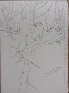
Draw main outline of a tree, including trunk and the main branches, and then roughly sketch in the diminishing outer branches and twigs.
Rough outline pencil sketch of apple tree in preparation for monochrome studies.
Prepare two supports, one with dark coloured wash and the other with a light grey background mixed opaquely or by using a wash. Copy the pencil image onto each with charcoal and light dust off the charcoal to leave a faint image.
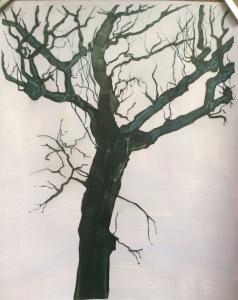
I chose to use an opaque ground of light grey. Using a rigger brush, I outlined the positive shapes of the trunk, branches and twigs, filling in the area with the dark wash colour with a flat and a medium round brush. I then added the finer twig shapes with the rigger. I tried to reduce the density of the colour as the twigs decreased in size.
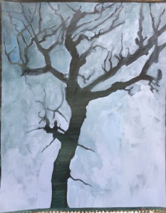
On a dark wash of Prussian Blue and Raw Sienna, using a light grey mix and a large flat brush, I cut into the drawing with negative shapes. As I neared the bulk of the branches I switched to a small flat brush. Once all the negative shapes were blocked in and the basic tree shape emerged, I added some of the dark wash colour to the mix around the twiggy branch shapes. It was suggested in the brief to modulate the grey tones further away from the main trunk as the thinner branches may appear to be a half-tone. Adding more of the darker wash colour to the negative shapes helped give the illusion of these twigs being finer and further away. I also became less precise and let the wash colour go over the dark branches and twigs so that they were less defined and sharp further away from the trunk. This worked well, and if this was a finished painting, I would also have worked more finer strokes for twigs as I did for the previous study.
Positive Shapes – Dark on Light.
Strengths:
Working this way round, I could see my faint charcoal line drawing clearly to follow the image, although of course, it would have been also have been just as easy to draw in with paint. The brain is used to positive shapes and more readily accepts what the eye sees the hand doing. Once the basic larger shapes were blocked in, it was also straightforward to add little fine flourishes eg the thinner twigs.
Limitations:
In this exercise the background was static and the image looked a little lifeless. You could of course, use negative shapes in the background to vary contrasts and tones however, once all those finer twigs were established you would risk losing them and having to reinstate them.
Negative Shapes – Light on Dark
Strengths:
When attempting a complex subject, drawing negative shapes around the subject can simplify a drawing. I found this previously in the drawing course, when drawing a basket of flowers. You can fool the brain by not concentrating on what the mind knows but only on what the eye sees. Cutting in up to the subject can also add texture, particularly with trees that are virtually in silhouette. Modifications can easily be made up to a point. The background can also be more expressive and tonally adjusted to help bring life and balance to the image.
Limitations:
Working with negative shapes, I found it quite difficult to see where my charcoal lines were and missed one particular small negative shape I had purposely drawn in. Concentration had to be constant in the early stages – this was particularly true working on a dark background. Fine lines, such as the end twigs were impossible to add by cutting around them, although, there is no reason why they could not be added in a positive way later.
I found that, particularly with the negative shape study, it would be very useful to use the two methods, opaque and transparent together to achieve an overall effect. Up to a point, I have used both in the same painting with realising it. This exercise has however, made me more conscious of the techniques and when they would be of use.


Good tree, not easy! I’m just doing the early trees in part 3 drawing…
LikeLike
Thanks Eve – yes they are tricky but can addictive!
LikeLike
Interesting exercise Gina, did you think of creating vertical lines or even random lines in the ground image of the second painting so that the texture of the tree looked more “lifelike”Mike
LikeLike
If it was a finished piece Mike I would have done but the point of the exercise was to explore using opaque and transparency together and we were asked not to over complicate the painting. Never one to make more work 😉
LikeLike